
Conservation-Grade Digital Restoration of an Alfred Birdsey Watercolor
There is something quietly radical about restoring a watercolor. Not repainting it. Not improving it. Not “making it pop.” Just bringing it back to where it once stood — and…
There is something quietly radical about restoring a watercolor. Not repainting it. Not improving it. Not “making it pop.” Just bringing it back to where it once stood — and then stopping.
This restoration involved multiple Alfred Birdsey watercolors from mid-20th century Bermuda. They arrived as many works from that period do: gently oxidized paper, perimeter mat burn, uneven warmth from aging cellulose, and pigments that had relaxed into a slightly muted state. Nothing dramatic. Just time doing what time does.
The process followed conservation logic rather than aesthetic impulse. That distinction matters.
Step 1 — Substrate Stabilization (Pass 1)
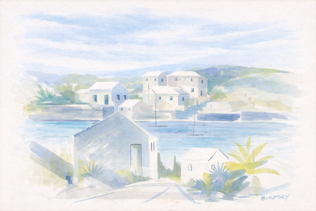
The first phase addressed paper only. Pigment was deliberately untouched.
Conservation-grade digital restoration of paper substrate only.
Mid-20th century Alfred Birdsey watercolor (Bermuda).

PREPARATION:
1. Rotate image 180 degrees to correct orientation before restoration.
2. Preserve full sheet including margins.

STRICT SCOPE:
Correct paper aging and degradation only.
Do not alter pigment hue, saturation, tonal relationships, brushwork, or linework.
No repainting.
No stylistic interpretation.

REFERENCE STANDARD:
Use the previously restored Birdsey watercolor from the same period as the calibration reference for:
- Paper tone (archival warm watercolor stock)
- Neutral balance
- Overall daylight temperature (approx. 5000–5500K)

Do not attempt to create bright white paper.
Match period-accurate cotton rag warmth.

PRIMARY CORRECTIONS:
1. Remove oxidation yellowing across exposed sheet.
2. Eliminate mat burn and perimeter darkening.
3. Remove tape staining and adhesive shadows.
4. Correct foxing and brown spotting.
5. Neutralize uneven background cast.
6. Even out paper tone across entire sheet while preserving texture variation.

TECHNICAL CONSTRAINTS:
- Preserve watercolor paper grain and tooth.
- Do not apply smoothing.
- Do not apply sharpening.
- No global saturation changes.
- No contrast boosts.
- No tonal compression.
- Maintain watercolor translucency.
- Maintain edge softness of washes.

COLOR TARGET:
Neutral museum daylight balance.
No sepia warmth.
No cool blue shift.
Match warmth level of the restored reference painting.

FINAL RESULT:
Sheet appears evenly preserved and archival.
Natural warm-white watercolor paper.
No visible age staining.
Pigment untouched.
Composition unchanged.
No digital artifacts.
This phase returned the paper to a stable archival appearance. It looked cleaner — not brighter. That distinction is essential.
Step 2 — Pigment Restoration (Pass 2)
Only after the substrate was stabilized did pigment correction begin.
Birdsey’s work is high-key and restrained. Overcorrection would immediately betray the original hand.
Perform pigment restoration and chroma rebalancing on this cleaned Alfred Birdsey mid-20th century watercolor.
STRICT SCOPE:
Restore original pigment values only.
Do not repaint.
Do not reinterpret.
Do not increase drama.
Do not increase contrast.
Do not oversaturate.
Preserve original brushwork and wash translucency.
REFERENCE STANDARD:
Use the previously restored Birdsey watercolor from the same period as the chromatic calibration reference for:
- Sky blue intensity
- Water turquoise balance
- Coral/terracotta architecture tone
- Foliage green softness
- Overall daylight luminosity
OBJECTIVE:
Recover pigment lost to age-related desaturation and oxidation.
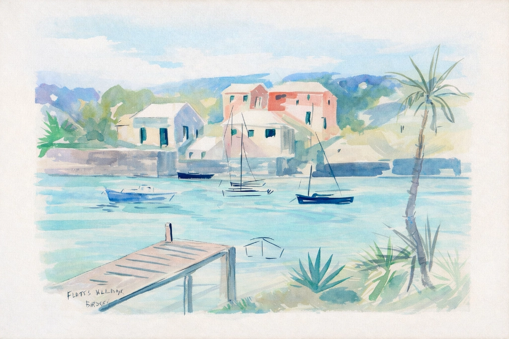
Return painting to authentic 1950s Bermudian daylight appearance.
PALETTE GUIDANCE (Birdsey-accurate):
- Sky: light cerulean to cobalt wash, soft gradient, no deep ultramarine.
- Water: muted aqua/teal with horizontal wash behavior.
- Buildings: high-key pastel coral, soft terracotta, chalk limestone white.
- Foliage: cool green with slight blue bias, not yellow-heavy.
- Dock: warm neutral wood, low contrast.
- Shadows: atmospheric and soft, never heavy or high contrast.
METHOD:
1. Remove any residual warm cast affecting pigment areas.
2. Subtle hue correction to restore blues in sky and water.
3. Restore pastel building tones without boosting saturation beyond reference.
4. Maintain watercolor transparency and paper interaction.
5. Preserve ink line softness — no sharpening.
TECHNICAL CONSTRAINTS:
- No global contrast adjustments.
- No clarity or texture sliders.
- No artificial vibrance boosts.
- Avoid tonal clipping.
- Maintain high-key watercolor range.
COLOR TEMPERATURE TARGET:
Neutral museum daylight (approx. 5000–5500K equivalent).
FINAL LOOK:
Freshly painted 1950s watercolor.
Airy.
Light.
Soft.
Natural.
No digital artifacts.
No modern color intensity.The outcome was subtle by design. Blues regained clarity. Greens separated gently. Pastel architecture breathed again without appearing digitally enhanced.

About Alfred Birdsey
Alfred Birdsey (1912–1996) was one of Bermuda’s most recognizable mid-century painters. Born in England, he settled in Bermuda in the late 1940s and became closely associated with the island’s visual identity during the 1950s and 1960s.
Birdsey painted rapidly and often outdoors. His work is defined by economical ink lines paired with loose watercolor washes. Rather than rendering exhaustive detail, he suggested form. Architecture dissolves into light. Boats float in abbreviated strokes. Hills become atmospheric silhouettes.
His palette was typically high-key and restrained: cerulean skies, muted aqua waters, limestone whites, soft coral buildings, and cool green foliage. Shadows remain atmospheric rather than dramatic. The result is intimate rather than theatrical.
Birdsey’s paintings coincided with Bermuda’s postwar transformation — increased tourism and modernization — yet his work documents the everyday harbor, the modest dock, the clustered pastel house. They are impressions of light more than records of structure.
Conservation vs. Enhancement
Enhancement tries to impress. Conservation tries to disappear.
The guiding principle throughout this project was restraint. Each prompt was engineered to limit interpretation and prevent modern intensity from replacing historical character.
When properly restored, a Birdsey watercolor should not look digitally corrected. It should look as though it were quietly unframed in 1955.
Paper warm. Pigment soft. Airy. Luminous. No drama. No artifacts. Just daylight over Bermuda.